Thesis Project
Solution
The problem
There is currently a gap in the market that lacks support for individuals looking to share valuable insights while also moving beyond mere information sharing and into concrete idea realization. This can be an opportunity for businesses or platforms to address this need by developing services that help bridge the gap between ideas and practical implementation, providing resources, tools, and guidance to enable individuals to turn their ideas into tangible results.
Onlyness Statement
A business model’s “onlyness” or mission statement serves as a guiding principle that prioritizes market relevance and customer value above all else. It shifts focus from internal operational efficiency to achieving external outcomes such as gaining market share and high customer satisfaction. This philosophy informs the design process, influencing everything from the style guide to day-to-day asset development. While it might initially appear deceptively straightforward, a well-crafted onlyness statement is actually a crucial component of any successful business strategy and organizational culture.
Onlyness Formula
[product/service/business] is the only [category] in the [location] that provides [benefit(s)] to [target audience] through [features].
Colony Of Voice Onlyness Statement
Colony of Voice is the only public speaking organization in the US Northeast Region that provides a participatory venue enabling idea creators to share their insights within a supportive culture and community.
The Statement Concept
To truly establish a brand identity that stands out in the market, a business model’s onlyness must have multiple functions beyond merely serving as a memorable slogan or jingle. It also needs to meet the specific needs and expectations of its customers, be distinctive from competitors, and accurately represent the company’s true core values.
Effective creation of an onlyness involves thorough understanding of:
- Market landscape
- Key market players, including competitors
- Target audience
This foundational knowledge enables the creation of a logo design that resonates with customers and effectively communicates the brand’s purpose.
Developing The Colony Of Voice brand identity involved meticulous research into identifying its unique niche within the market. This process involved evaluating various design elements, such as logos, color palettes, and messages.
However, this careful consideration also introduced an important risk: conformity. In 2007, Nokia’s failure to embrace innovation and creativity led to a loss of market edge due to stifled creative growth. The Colony Of Voice style guide seeks alignment with established brand norms but maintains room for innovative thinking within those boundaries.
This approach balances the need for consistency in brand voice and personality with the recognition that not every project requires complete originality. By allowing some conformity while still leaving space for creative expression, The Colony Of Voice aims to strike a balance between tradition and innovation.
Iterations
- COV is a public speaking organization.
- COV is a public speaking organization in New York. (wait, just NY?) …in the Northeast Region.
- COV is a public speaking organization … (wait, is it just an organization? a coalition? a group?) … a participatory venue.
- COV …are doers. (hold on, what does that even mean?)…enabling idea creators to share their insights (with each other?) within a supportive culture and community. A.k.a. investors or a people who can help.
The final result is a combination of purpose and connection where the brand explains the value they bring to the participants and appeals to a segment of people in the marketplace.
Voice & Tone
The significance of voice and tone extends beyond merely being a communication technique to an encompassing aspect of brand identity and culture. The concept can be explored through qualitative research methods such as auto-ethnographic analysis.
This style of research, popularized by academics in 2026 using personal letters from two academics, offers a non-traditional approach that diverges from the standard academic structure. By delving into their own experiences and observations on voice and tone, researchers can capture meaningful insights that might otherwise be lost in traditional surveys or focus groups.
This experimental style of research provides a unique perspective on how voices are perceived and interpreted by others. It highlights the personal narratives and stories associated with specific brands, allowing for a more nuanced understanding of how tone shapes interactions between consumers and the company.
In 1999, a Power Point presentation was utilized as a platform for delivering an explanation to employees across different levels within Nokia in Manaus, Brazil. The audience consisted of frontline workers alongside high-ranking executives like Vice Presidents.
The initial message focused on cooperation and methodology while incorporating real-life examples from Hershey’s Manufacturing that suffered due to shipping disruptions during the Halloween season. This unexpected disclosure caught many off guard but surprisingly influenced the tone set at the beginning of the project.
The speaker, a 29-year-old responsible for an $8M expense budget along with handling infrastructure challenges posed by the Amazon region, was able to upgrade his first class airline ticket. The experience proved that voice and tone can significantly impact employee behavior and outcomes.
This anecdote illustrates how setting a consistent message at the start of a large-scale transformation project can lead to substantial success. It highlights that even across different levels within an organization, a strong brand voice can influence decisions and actions in meaningful ways, ultimately contributing to smoother implementation of complex projects like manufacturing operations.
Colony Of Voice represents an approach to leadership that emphasizes overcoming challenges posed by the status quo for the sake of progress. This involves navigating obstacles while maintaining a strong focus on collaboration, evidence-based decision-making, and prioritizing scientific methodologies.
While Colony Of Voice is not structured as a traditional authoritarian or hierarchical model, it does involve effective leadership practices without being rigidly authoritarian in nature.
Feedback from users suggests that this approach fosters insightful communication, supportive relationships, and alignment between intentions and perceptions. The tone of the voice aligns with a grade 10 level when measured using tools like the Hemingway app, an indicator of clarity and simplicity in messaging.
The key takeaway is that Colony Of Voice represents a more organic leadership model than traditional corporate or governmental structures, allowing for effective collaboration and progress in a way that prioritizes the well-being of employees and the organization’s goals.
Look & Feel
In designing visual identities for brands, several strategic communication tools must be employed to ensure consistency and cohesion. These include color (emotional background), typography (personality), lines (directional flow), shape (stability) texture (sensory experience), and imagery (brand story).
To achieve a unified appearance that effectively represents the brand, these design elements need to work in harmony with one another. This harmonization enables the visual identity to transcend individual components and become a cohesive whole.
By considering how color evokes emotions, typography communicates personality, lines guide viewer flow, shape provides structure, texture offers sensory experience, and imagery conveys core values, designers can integrate these design elements into an overarching aesthetic that captures the essence of the brand.
Marshall McLuhan’s The Media Is The Massage (1996) explores the profound impact of global interconnectedness on human experience and communication. He posits that in this ‘all-at-onceness,’ media experiences supersede written language in conveying messages.
At its core, McLuhan emphasizes perception and emotional resonance over strategic communication techniques. He suggests that design elements like color, typeface, lines, shape, texture, and imagery create metaphors that carry meaning.
The key takeaway is that the interpretation of these visual metaphors lies with the audience, not designers. Understanding how these elements elicit a desired response or sentiment in the audience becomes crucial. This highlights the importance of audience-centered design, where designers focus on evoking specific emotional responses or associations rather than strictly adhering to established communication strategies.
By recognizing that meaning is derived from interaction with visual elements and their impact on the viewer’s perception, McLuhan encourages designers to adopt a more holistic approach to creating cohesive brand identities.
Designers should prioritize the intended impact of their elements over their original purpose or intent. The true measure of a successful design is not the designer’s understanding but rather its effect on the target audience.
This mindset underscores the significance of effective storytelling through visual communication, acknowledging that meaning resides in how it resonates with those interacting with the brand.
By considering the emotional, psychological, and experiential implications of each element of design, designers can craft a cohesive narrative that speaks to their audience. The power lies not in adhering to traditional design standards but in understanding how design choices influence users’ perceptions, memories, and actions.
Ultimately, this perspective encourages designers to engage more deeply with the needs and experiences of their target audience, using intuitive storytelling techniques that tap into their desires and pain points.
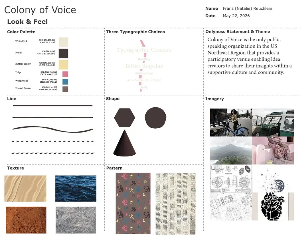
Color
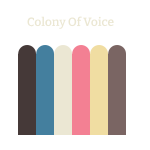
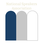
The chosen color palette is not just representative of the culture, in it’s softness, earthiness, with coolness (achieved with a gray tint), but as what the culture was not. It is not, the corporatized version of societal ideas and solutions painted in bold primary colors.
| Color Palettes | |||
|---|---|---|---|
|
|
|
|
Comparison
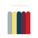
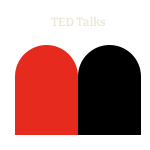
| Feature | Colony of Voice (Original) | Toastmasters (Cool) | TED talks (Bold) | NSA (Muted) |
|---|---|---|---|---|
| Dominant Feel | Warm, Earthy, Cozy | Cool, Minimalist, Calm | High Contrast, Dramatic | Sophisticated, Deep, Muted |
| Temperature | Predominantly Warm | Predominantly Cool | Balanced/Aggressive | Balanced/Deep |
| Complexity | High (many mixed tones) | Low (monochromatic) | High (extreme contrast) | Medium (subtle richness) |
(Google, 2026)
Designers adhere to TailwindCSS philosophy when crafting color palettes. While it primarily focuses on light and dark variations, this approach also considers the number of design elements.
In essence, designers define key colors first and then gradually build up a palette by adding 11 shades or steps in between. This strategy aims for harmony across various visual elements, including backgrounds, text, buttons, and other interactive components.
While not central to the thesis, exploring expanded visual elements could indeed broaden the concept of brand color palettes. It opens possibilities for more sophisticated designs that better align with today’s expectations for visual clarity and user experience.
However, it is worth noting that this approach can be resource-intensive, requiring a comprehensive assessment of each design element and its relative importance to the overall brand narrative. Nonetheless, for brands seeking to differentiate themselves through cohesive visual identities, incorporating dynamic color palettes presents a compelling opportunity for artistic expression and strategic branding.
These 11 colors can then be connected to elements of web design as follows:
Web Design Elements
- Background Color
- Text Color
- Text Decoration Color
- Border Color
- Outline Color
- Color Of Box Shadows
- Color Of Inset Box Shadows
- Color Of Ring Shadows
- Color Of Inset Ring Shadows
- Accent Color Of Form Controls
- Caret Color In Form Controls
- Thumb Color's Scrollbar
- Track Color's Scrollbar
- Fill Color Of SVG Elements
- Stroke Color Of SVG Elements
The Colony Of Voice’s color palette has effectively achieved its specifications by using more subdued hues. However, a critical aspect of this design involves evaluating audience reactions once the palette is implemented in different settings such as media and social platforms.
This assessment will reveal whether users respond positively to these muted tones or if they negatively impact brand recognition and overall user experience. Additionally, it may uncover potential issues like insufficient contrast with other visual elements on each platform.
Further research could involve A/B testing various shades across multiple platforms to determine the most suitable colors for different contexts while maintaining consistency across all media types (e.g., print, digital, video). This analysis will help refine the color palette further and potentially pave the way for innovative applications that blend tone with visual storytelling.
Type
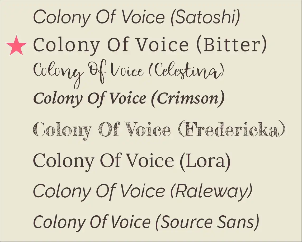
The typography used in The Colony Of Voice’s brand identity was designed to strike a balance between its business-oriented and creative profiles. By incorporating Bitter, a serif font known for enhancing readability across digital platforms while imparting formality, designers aimed to create a harmonious visual flow.
Key aspects of this selection include:
- Formal tone: Bitter provides the necessary gravitas and professionalism required by organizations with complex operations.
- Readability: Its high legibility ensures that text is easily understandable across various digital platforms and mediums, enhancing overall user experience.
A variable font allows for dynamic adjustments in style through different typographic choices. This capability streamlines management of typography across multiple contexts and applications.
By embracing Bitter as the primary font, The Colony Of Voice has successfully bridged its corporate and creative profiles with a cohesive visual identity that speaks to both sides of the brand’s spectrum.
To further refine The Colony Of Voice’s brand identity through typography, design adjustments were made to differentiate between the organization name, tagline, and body text.
- Typography hierarchy: The organization name is displayed in bold, creating a clear distinction from the rest of the text.
- Logo placement: Incorporating the logo itself as part of the typography for certain symbols creates an additional layer of visual connection to the brand, enhancing overall recognition.
The use of Bitter as the primary font aligns with the organization’s need for readability across digital platforms while imparting a professional and cohesive tone. By implementing typographical adjustments and stylization in line with this choice, The Colony Of Voice can maintain its distinctive identity within any medium, from formal documents to digital communications.
Key aspects of typography implementation:
- Readability: Ensuring the legibility of the text across various platforms is paramount.
- Consistency: Maintaining a uniform visual appearance throughout different mediums and contexts enhances overall brand recognition.
- Visual differentiation: The use of bold and regular font styles serves to create clear visual distinctions between components of the design.
Line
Here’s a list of five line types that can represent the soft and hard parts of the planet Earth, ideal for a shape palette for an innovation company:
Line Types
The meaning of lines is a question that can potentially strive to explain the meaning universe but to keep thing within the realm of basic understandability with the basic lines of understanding (Rafael, 2022).
| Line Type | Description |
|---|---|
| Curved and Flowing | Represents geological features like rivers and oceans; conveys softness and fluidity. |
| Jagged and Angular | Symbolizes mountains and rocky terrains; evokes strength and resilience in nature. |
| Wavy and Undulating | Captures the softness of grasslands and rolling hills; adds a sense of movement. |
| Straight and Rigid | Reflects human-made structures (roads, buildings); signifies stability and order. |
| Dotted and Fragmented | Represents the diversity of ecosystems (flora and fauna); introduces complexity and variation. |
As the design elements are defined, their inherent characteristics reveal themselves. The use of flowing lines that convey the essence of nature adds a vital layer of depth to the visual identity.
- Nature-inspired motifs: By incorporating organic shapes like waves or curves into the logo and branding, designers aim to evoke feelings of fluidity and movement.
- Representing progress: These flowing lines serve as a powerful metaphor for turning ideas into tangible outcomes. They represent the transformation process that occurs when creativity meets implementation.
Meaningful visual metaphors:
The wavy lines not only symbolize nature but also capture the essence of change, growth, and fluid motion. By incorporating such motifs into their brand identity, organizations can convey a clear message about the values and ideals they uphold.
Shape
The Colony Of Voice’s logo design incorporates shapes inspired by bee colonies, symbolizing cooperation.
Bee colony structure: By emulating the hierarchical organization of bees within a colony, designers have created a visually appealing representation that echoes their organizational values. Transference and transformation: The image of passing nectar from one worker bee to another illustrates how ideas are transmitted through a process. In this case, it represents the sharing and development of innovative concepts.
Nectar: Representing ideas, these can take many forms - research, strategies, products, or services. The idea is that by passing nectar from worker to bee, you facilitate the refinement and growth of those ideas. In essence, the more bees working together in this collaborative process, the more effective your organization becomes.
Honey: This symbolizes outcomes. When honey is produced through the cooperative effort of these bees, they’ve successfully converted their collective nectar into tangible results - whether it’s a product, a service, or some other value created.
By using this visual metaphor, The Colony Of Voice creates a compelling story about its organizational culture. This cohesive narrative emphasizes their commitment to collaboration, innovation and progress through the development of ideas from shared input and collective action.
By harnessing these symbolic elements in their design, The Colony of Voice has given its brand an engaging meaning that resonates with stakeholders - employees, customers, partners, etc.
The hexagon derived from the bee hive is the core shape for the brand.
Texture
###Five textures* that beautifully capture the duality of soft and hard elements of planet Earth:
| Texture | Description | Represents |
|---|---|---|
| Bark Texture | Rough, fibrous surface with deep grooves and irregularities. | The strength and resilience of trees and forests. |
| Sandy Dunes | Fine, granular texture that shifts and flows. | The softness and dynamism of deserts and beaches. |
| Granite | Polished, hard surface with speckles and varying colors. | The solidity and endurance of mountains and rocks. |
| Water Ripples | Soft undulating surface that reflects light, creating movement. | The fluidity and adaptability of rivers and lakes. |
| Clay | Smooth, malleable surface with a slightly gritty feel. | The nurturing and formative qualities of soil and earth. |
Insights on Texture Choices
- Bark Texture signifies strength and longevity, reminding us of the vital role trees play in the ecosystem.
- Sandy Dunes reflect adaptability, analogous to how life can thrive in harsh conditions.
- Granite represents the solid foundation of the Earth, showcasing the strength required to support life and structures.
- Water Ripples convey a sense of calm and change, embodying the cycles of nature and the importance of water.
- Clay symbolizes growth and potential, highlighting how the Earth nurtures life through its rich soils.
Each of these textures can enhance the sensory experience for your designs, offering a tactile reflection of our planet’s complexities. Please let me know if you’d like more ideas or help expanding on these concepts!
Imagery
At Colony Of Voice, there was an initial ambiguity regarding whether photographs or illustrative drawings would be employed in their designs before conducting experiments with both mediums.
Upon reviewing and sorting through a collection of images, based upon the idea of designers pondering the fundamental question: When should photos be utilized, and when should illustrations be used? This inquiry led to a simple yet purposeful guideline for stylistic consistency, rooted in a deliberate distinction between the roles these visual elements play.
From a design perspective, the solution proved straightforward; however, from a more abstract standpoint, it represents a nuanced approach to distinguishing Colony Of Voice’s visual identity from that of other organizations often represented by photographs of people speaking on stages.
Vision Board
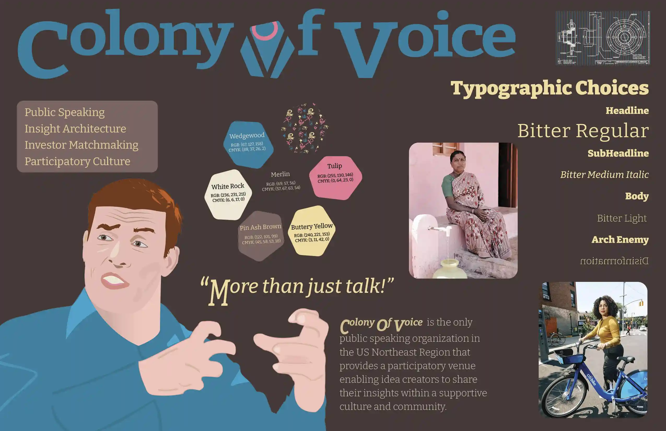
As some people may say about the vision board although not academically validated nor properly presented – ‘The snapshot of the vision board helps brands emerge, gets movies funded, makes pitches stick and planets turn.’ That is what in the world of academia will call not properly presented with it’s lack of sources and validation. Yet, the idea of design isn’t a scientific paper, a physics paper, a mathematical proof, so what’s design, in relation to media, really?
Logo Development
The role of logo designers has undergone considerable changes in recent years.
-
Evolution of logos: Initially, logos were simple symbols with minimal design elements that conveyed meaning without much consideration for aesthetics or overall visual appeal.
-
Shifts in expectations:
- The increasing use of multiple channels (such as billboards and social media profiles) has raised the bar for logo designs. They must look good in various scale sizes, from a single pixel on a profile picture to large-scale billboard displays.
- Logos are now expected to be easily translatable across languages, cultures, and geographical regions, allowing them to reach a wide audience without any need for translation.
Key requirements for modern logos:
- Versatility: They must remain legible, clear, and visually appealing in multiple formats and sizes.
- Language neutrality: A single logo should be able to convey the organization’s brand identity regardless of language or cultural context.
By taking these evolving expectations into consideration, designers have had to adapt their skills and approaches. The use of digital design tools has become crucial for creating logos that can effectively communicate across various mediums.
The modern logo is a much more complex and nuanced element than its predecessor, requiring an understanding of brand identity, communication strategies, and the visual language required for successful global marketing campaigns.
Today’s logo design is far more sophisticated than its predecessors.
Designers like Paul Rand are known for creating logos that can address various requirements simultaneously, such as simplicity and versatility. IBM’s simple yet effective logo stands as an example of a well-designed mark that has remained consistent across different contexts.
However, design was once more challenging. For instance, when Paul Rand was working on the IBM logo in the 1950s, there were fewer tools at his disposal and less guidance about what constitutes successful logos. He even mentioned not knowing how to solve certain problems he encountered and admitted that he sometimes relied on instinct rather than a clear plan.
Key points:
The advancements we have today in design allow for more precise execution. Even past innovators like Paul Rand pushed boundaries with their designs, demonstrating the value of innovation and creative problem-solving in logo creation.
Concept
The Colony Of Voice logo was inspired by biomimicry, drawing from the intricate hexagonal structure of bees and their interconnectedness within a hive.
However, when translating these concepts to create a unified visual identity that included human representation, challenges arose. The design team faced difficulties in creating an effective mark that could encompass both elements - bees and humans - while still being accessible across diverse contexts.
To overcome this hurdle, the team employed a simple yet effective approach: reducing complexity to make it easy to execute and understand.
This process represents an ongoing learning curve for logo designers because logo design is fundamentally rooted in art rather than science. It requires balancing aesthetics with functionality, and there may be no clear-cut solution or formula for achieving perfection.
Selection
The design process for The Colony Of Voice’s logo commenced with an evolutionary approach, where the hexagonal motif dominated the ideation phase. This focused emphasis on a singular idea laid the groundwork for subsequent iterations.
However, as exploratory attempts expanded into various directions, the value of refinement diminished. By the time minor adjustments were made to these concepts, numerous paths had been pursued, yielding limited results. A more concentrated exploration would have facilitated the discovery of more viable options.
A more effective design strategy might involve concentrating on promising avenues and refining them through a more thorough process. This approach could yield better solutions that align with The Colony Of Voice’s needs.
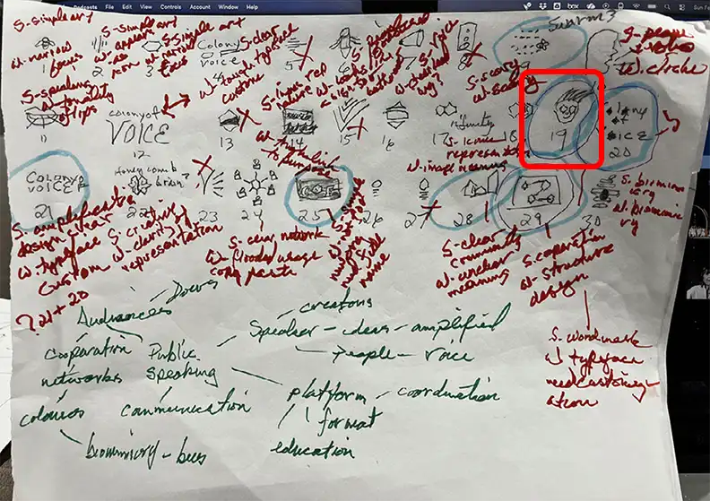
However, inspiration from the poster for Almost Famous (Crowe, 2000) served as a catalyst for developing a usable visual metaphor. The final result has been dubbed the “Big Oh” and has proven scalable and recognizable, despite not boasting an exceptional level of visual quality. Ultimately, it fulfills the primary purpose of a logo by meeting its functional requirements in various contexts.

Final
Then final review required simplification The final logo is:

Refinement
Refining and finalizing the design was paramount.
Initial reactions from stakeholders necessitated simplifying the initial graphic representation to create an attractive, legible mark that would be suitable for use as a logo.
The process of fine-tuning elements allowed for the development of an emblem with a clear purpose: it represented both the speaker’s voice and the concept of a colony - effectively capturing the essence of The Colony Of Voice.
Through iterative refinement and collaboration among key stakeholders, the design evolved from its initial conceptualization to a refined, cohesive visual identity.
Finalization
Once finalized, the Big Oh, Colony Of Voice logo showed great promise in various dynamic applications.
Its ability to effectively integrate into different brand communication channels was demonstrated through its versatility in animation and potential for harmonious interactions with other design elements.
In particular, it paired well with the accompanying wordmark, which featured realigned capital letters aimed at achieving an optimal x-height alignment. This streamlined arrangement created a cohesive visual identity across all visual communications, effectively communicating The Colony Of Voice’s mission and values.
Through careful refinement of both the logo and the accompanying typography, The Colony Of Voice successfully crafted a unified visual language that could be consistently applied across diverse media platforms.

Brand Media Assets
Style Guide
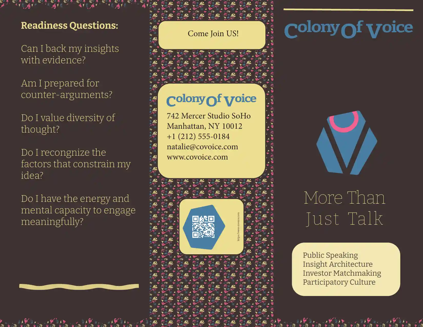
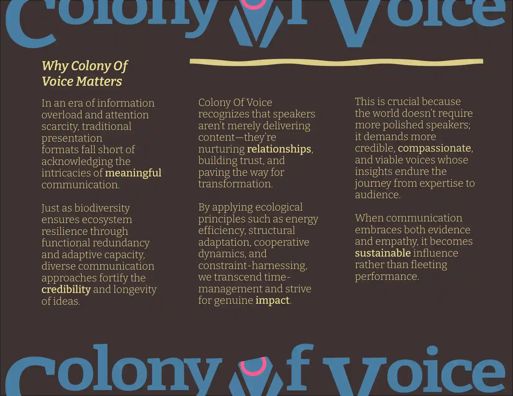
Brochure
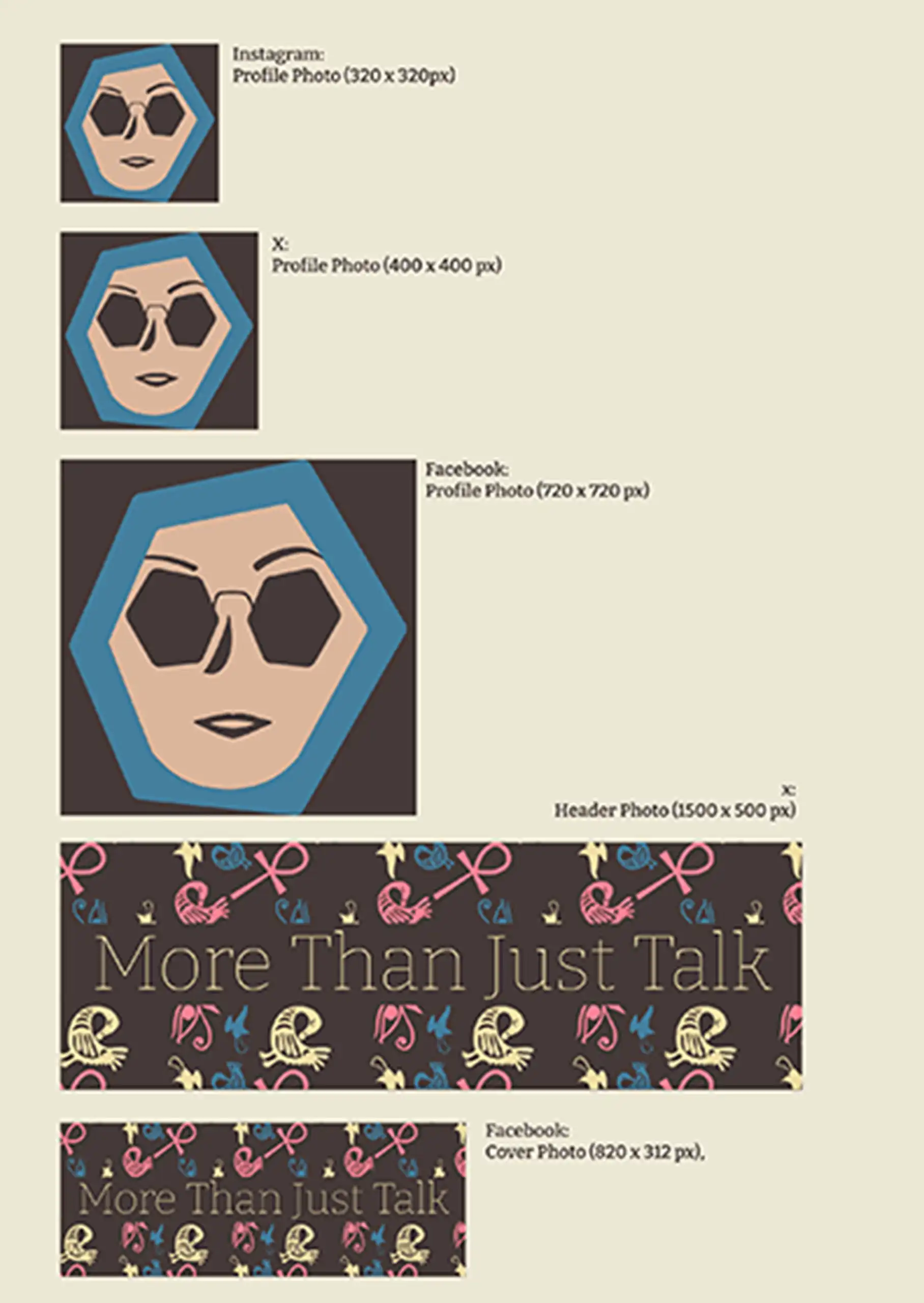
Social Media Assets
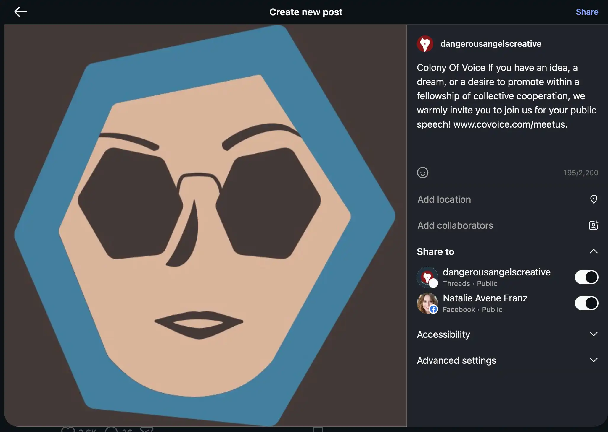
Sample Instagram Post
Design Evaluation
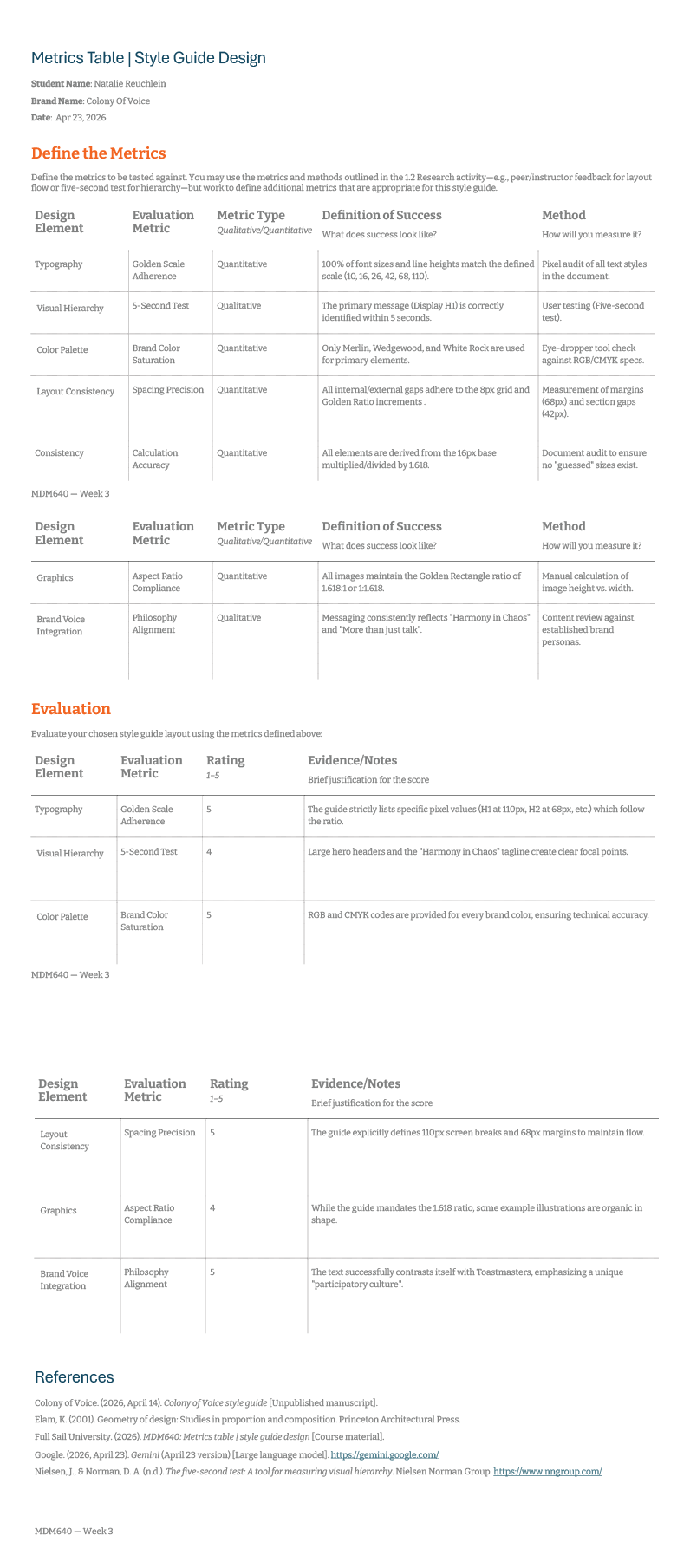
To ensure consistency and clarity across media assets, The Colony Of Voice developed the style guide.
The Colony Of Voice Style Guide serves as a reference document for designers, providing guidelines on design principles that shape the brand’s visual identity and ensuring its uniform application throughout various mediums. Key aspects of this guide include:
- A general overview of the brand identity, allowing users to grasp its essence.
- Specific guidelines for typography (type) and object-oriented designs.
A key component of this guide is the golden rule scale for both type and objects. This scale allows designers to measure consistency against predefined standards in order to maintain high-quality visual communications.
Iterative feedback loops were established during the development process, with each iteration reflecting early observations and critiques. These exchanges played a vital role in refining the style guide into an effective tool for developers to ensure seamless brand expression across different media channels.
Through the development of this comprehensive resource, The Colony Of Voice enhanced its cohesive visual identity across diverse platforms, providing clear guidelines for designers to create visually appealing communications that resonate with its audience.
This collaborative design process also facilitated a deeper understanding among key stakeholders regarding the importance of maintaining consistency throughout all brand interactions.
References
Bitter. (n.d.). Google Fonts. Retrieved May 23, 2026, from https://fonts.google.com/specimen/Bitter
Colors—Core concepts. (n.d.). Retrieved May 21, 2026, from https://tailwindcss.com/docs/colors
Crowe, C. (2000). Almost famous [motion picture]. Vinyl Films.
Gal, M. (2022). Visual metaphors and aesthetics: A formalist theory of metaphor. Bloomsbury Academic.
Google. (2026). Gemma4. Local Drive.
McLuhan, M., Fiore, Q., & Agel, J. (1996). The medium is the massage: An inventory of effects. HardWired.
Parsley, S., & Acevedo, B. (2026). Pieces of me, letters from us: Collage-making as embodied reflection in autoethnography. Culture & Organization, 32(2), 83–106. Business Source Complete (191985561). https://doi.org/10.1080/14759551.2024.2394450
Rafael, L. (2022, August 19). Line Symbolism: A Guide to What Different Lines Represent. The Shutterstock Blog. https://www.shutterstock.com/blog/the-psychology-of-lines
Reuchlein, F. (1999). Brazil SAP R/3 Implementation [PowerPoint slides]. Unpublished manuscript.“
The Double-Edged Sword of Conformity: When Fitting In Becomes Detrimental - PsyForU Research International. (2025, June 16). https://psyforu.com/the-double-edged-sword-of-conformity-when-fitting-in-becomes-detrimental/